
System Icons for Lumosity
Lumosity is a brain-training platform with over 100 million subscribers and a product library spanning over 40 games across web, iOS, and Android. At some point during our initiative to redesign the platform, the design team had to reckon with the fact that no existing icon set was ever going to fit a product this specific.
Role & Responsibilities
- Design Lead
- Icon Design
- System Integration
deliverables
- 80+ Icons, Outline Style
- 32px Icon Grid & Style Guide
- Icon Component
team
- Solo Initiative & Execution
01 — PROBLEM
Why borrowed icons stop working
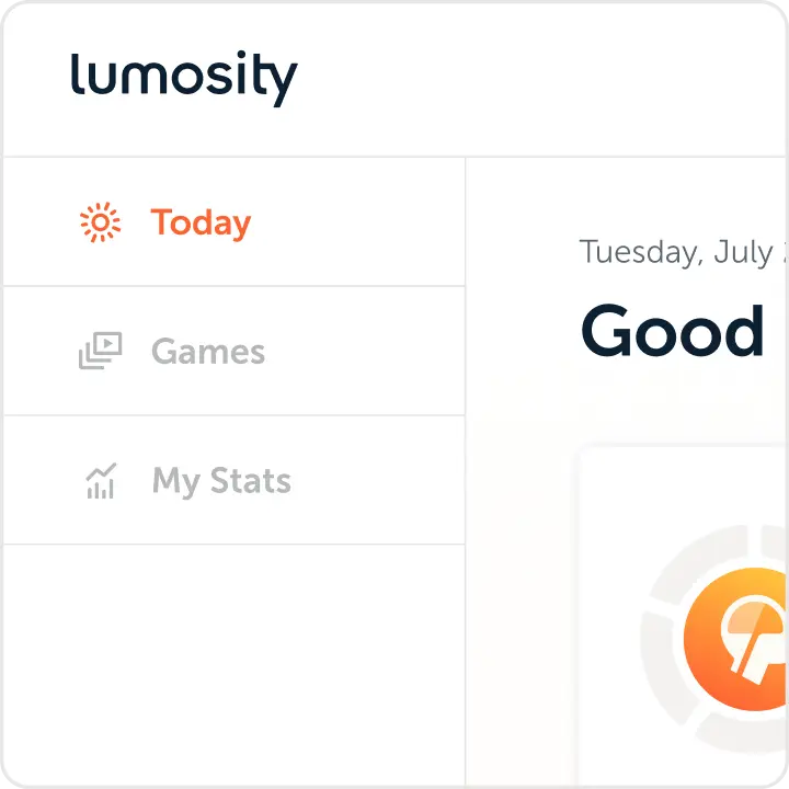
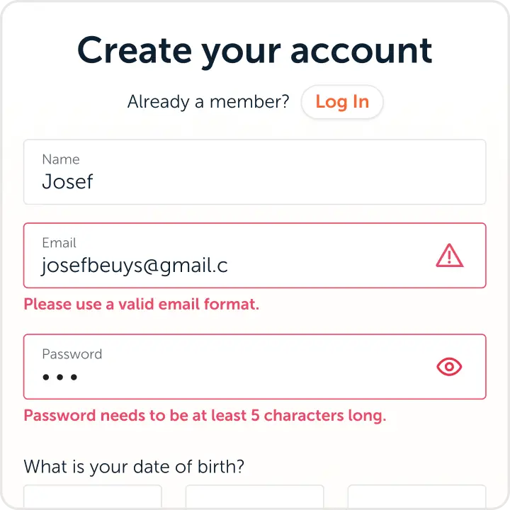
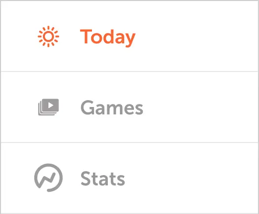
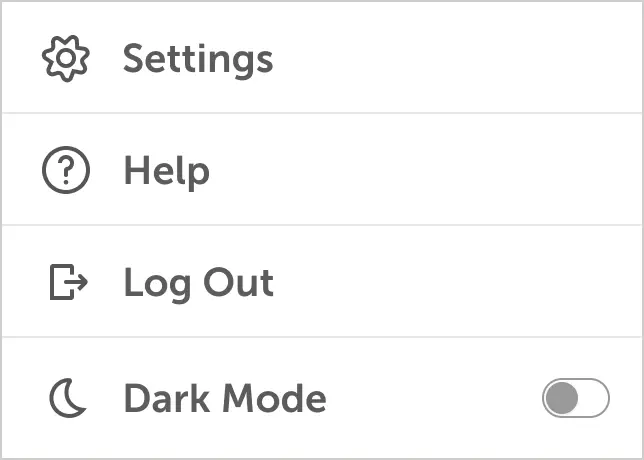
Every time the design team needed an icon, we reached for whatever set was closest. The result was a product UI assembled from mismatched visual vocabularies. Metaphors were duplicated and styles drifted and, ultimately, nothing felt like it belonged to the same system. The fix was not to find a better third-party set that had all of the required metaphors of the application, but to build one ourselves.














02 — APPROACH
Taking stock of what we were actually using
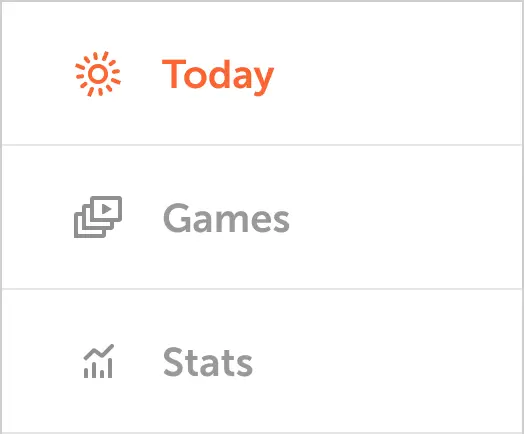
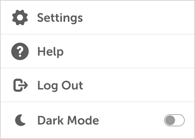
Before drawing anything, I inventoried every icon in use across the product. The goal was to see what we actually had in use and the requirements of the system: metaphors, duplicates, nouns, verbs, categories. Some icons were redundant, while others were functionally misaligned with what the UI was asking them to do. The audit produced a clear picture: here is what we keep, here is what we cut, here is what is missing.
03 — DESIGN DETAILS
A system rooted in the brand
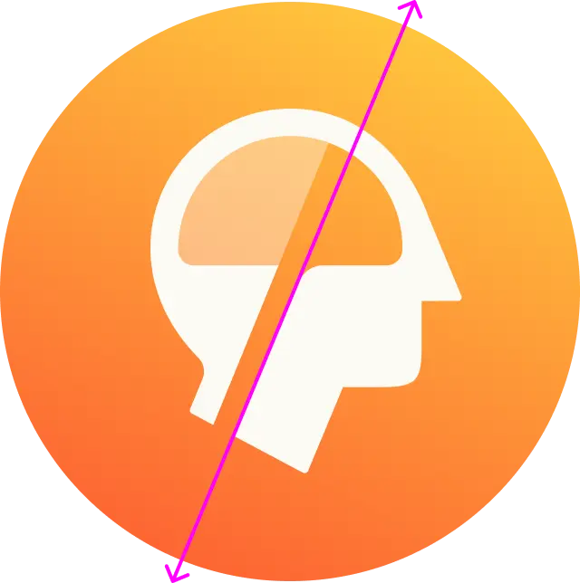
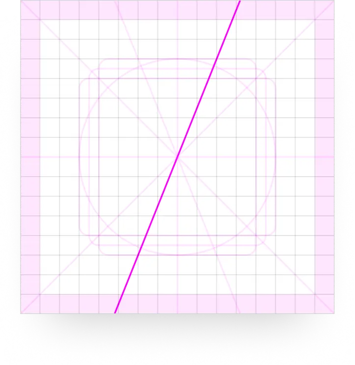
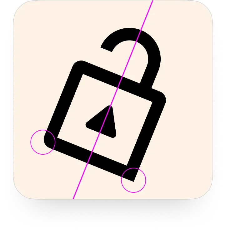
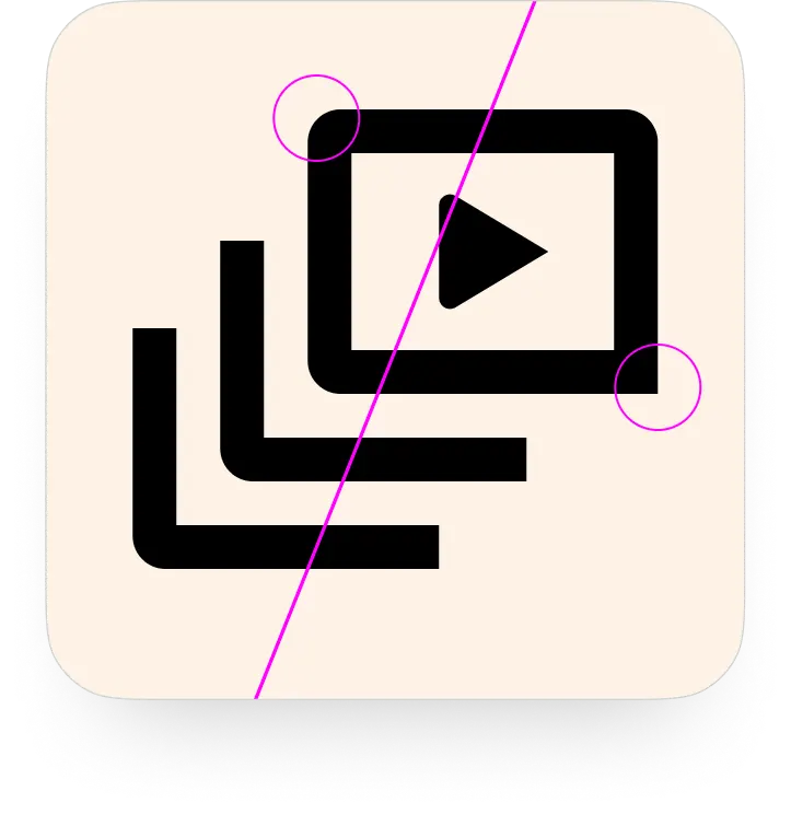
I studied the Lumosity wordmark and typeface before committing to any parameters. The grid I landed on used a consistent stroke weight with a deliberate mix of rounded and capped stroke endings, a detail invisible at a glance but felt across the whole set. I also extracted a specific diagonal angle from the Lumosity logo mark and built it into the grid. Icons live on the grid when the form allows it. When a slanted element appears, that same angle shows up again, a quiet thread connecting the icon system back to the brand it belongs to.
04 — OUTPUT
More than 80 icons with one visual voice
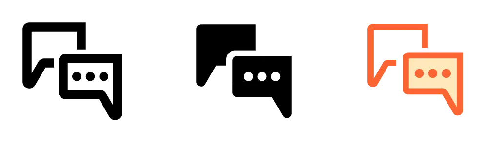
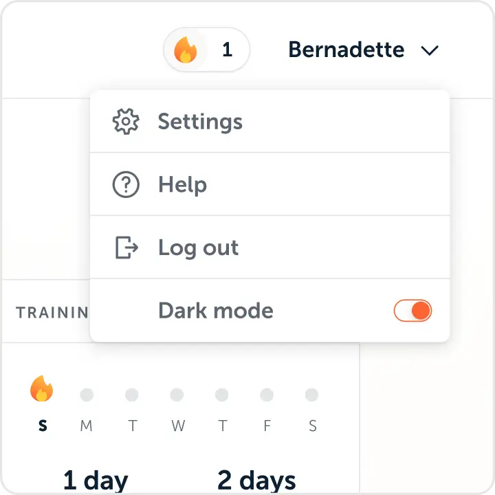
The first iteration was the delivery of over 80 icons, all in one outlined style, sized at 32px in SVG format, with back-up PNGs if needed. Fill variants were added selectively as use cases required them. The set was adopted immediately by both design and engineering and can be seen being used in the most recent updates to the platform.

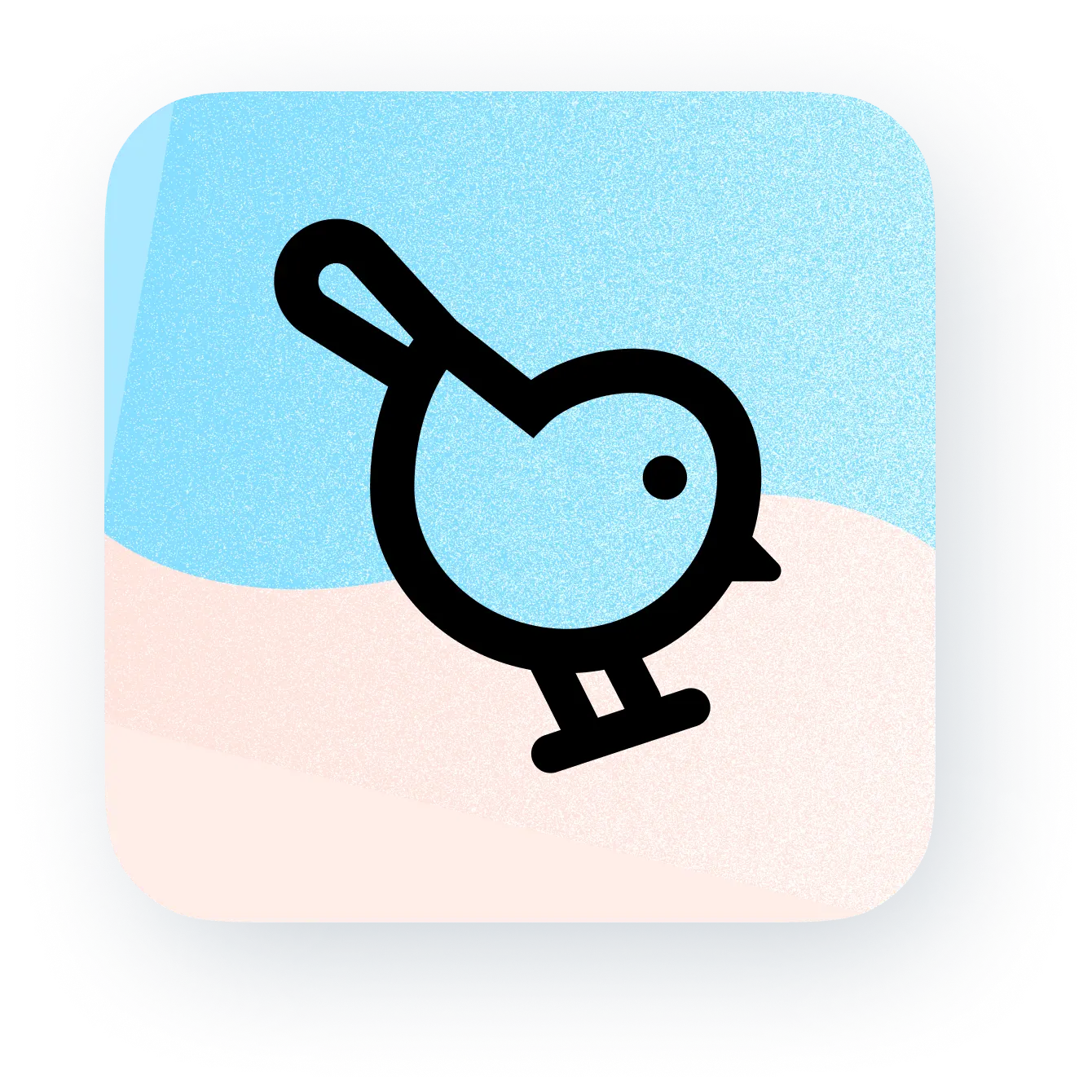
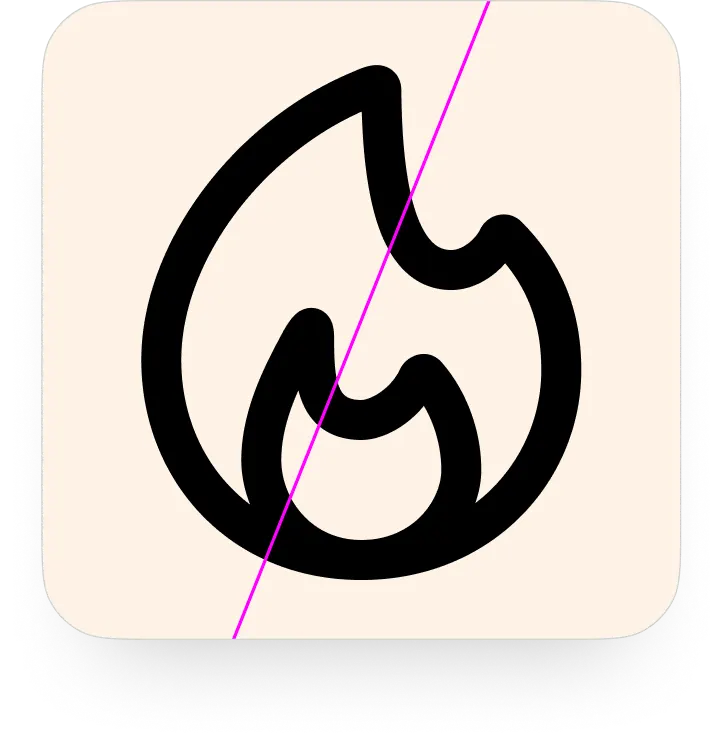
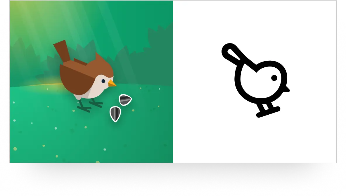
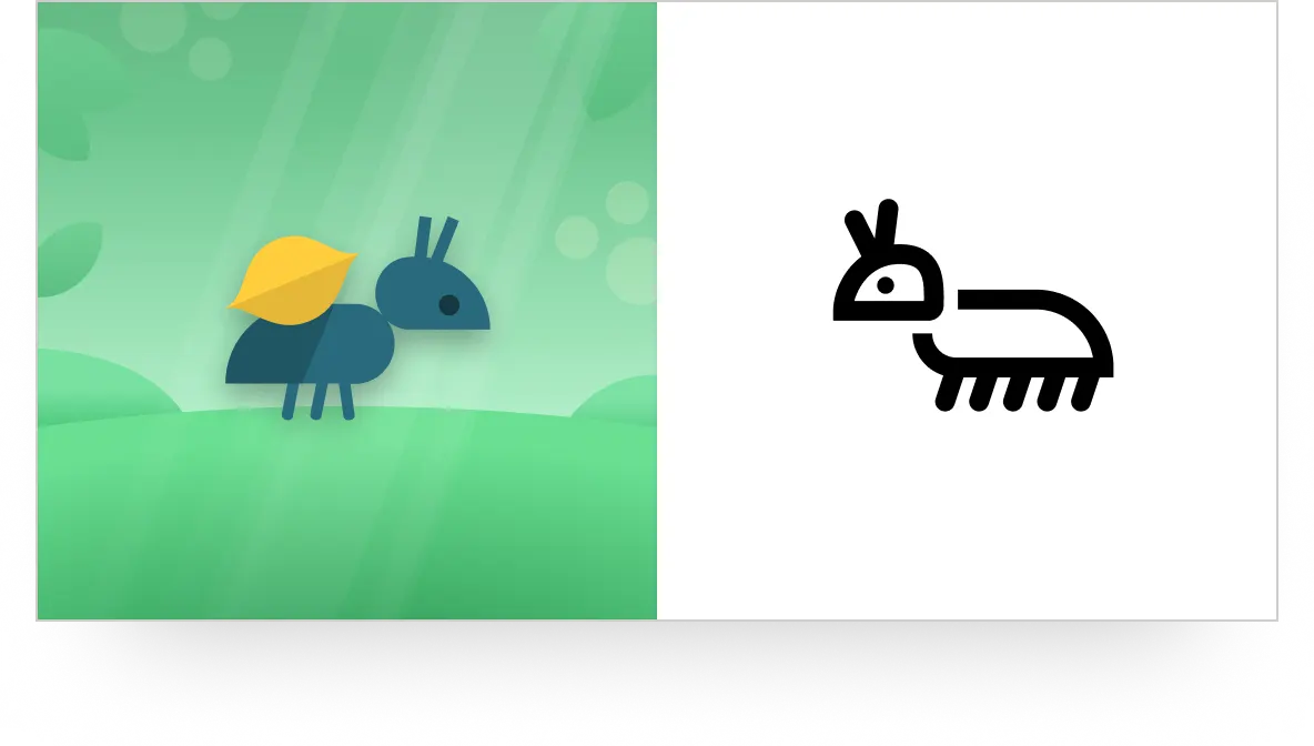
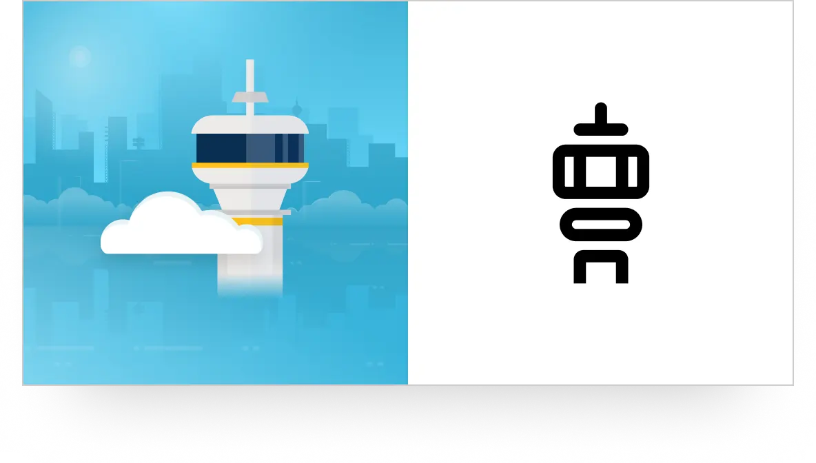
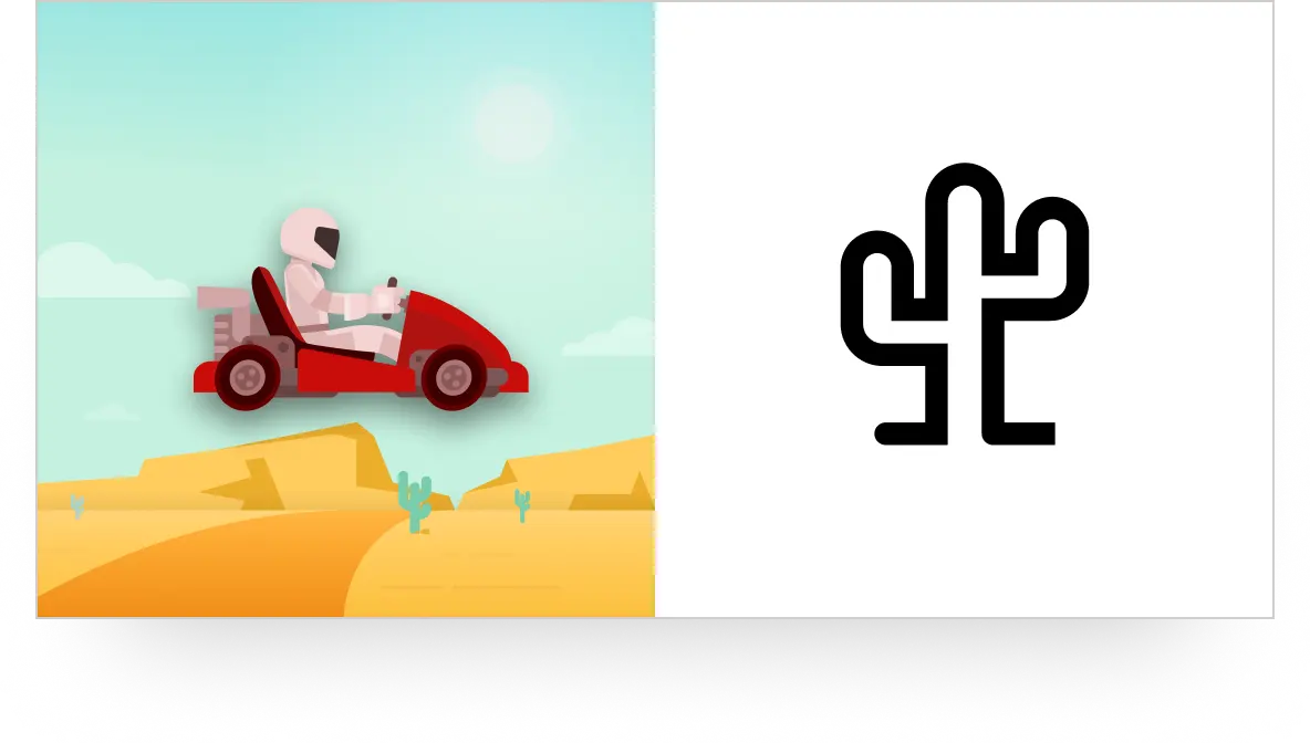
As a proof of concept I included four unique game glyphs that were simplified, single-color symbols that could be paired with their respective game, distinct from the game’s full-color illustration assets. This gave the set a character and whimsy that no off-the-shelf library could replicate.
05 — REFLECTION
Growing the original set
My goal, had I stayed at the company, would have been to continue refining the set; adding complementary fill versions for each icon, duotone versions, and continuing to add new glyphs as needed. The documentation around the icon styling, border choices and end caps as well as the audit, hopefully sets up the next design team to do this work without the original creator.