


Product Design at Lumosity
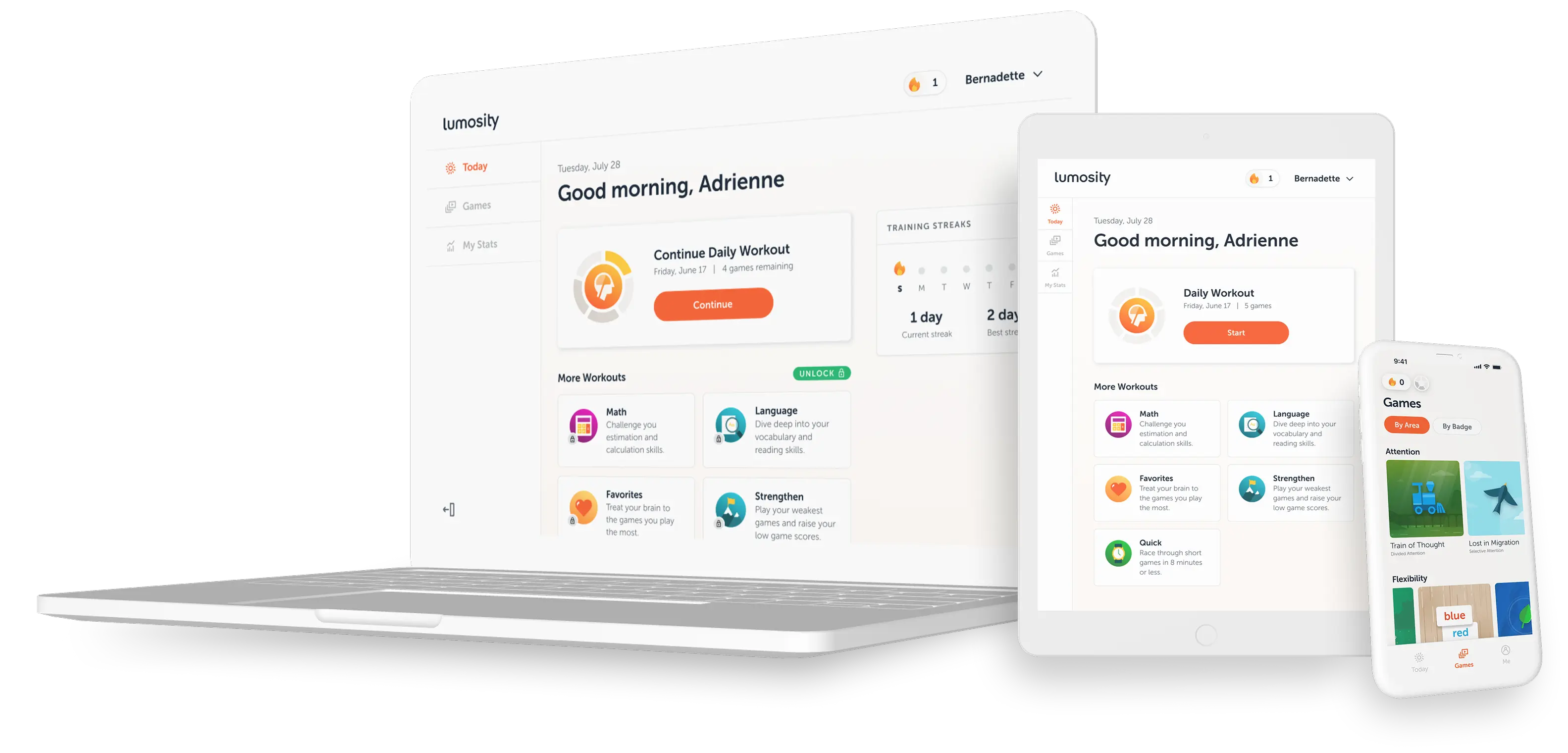
I was one of three on the Lumosity design team leading the initiative to redesign the entire end-to-end experience for the company’s flagship product. Over a period of about 18 months, I delivered prototypes, UX flows and production UI for every surface of the web product.
Role & Responsibilities
- Product Design Lead
- UX, UI, & Interaction Design
- QA, User Research & Testing
- Brand & Marketing
deliverables
- Prototypes
- UX Flows
- Production UI
- Design System
team
- 2 Designers (ICs) + 1 Manager
- 15+ Software Developers
- Games Team
- 2 Product Managers & Lead
01 — BACKGROUND
A decade-old product with a brand new experience
Lumosity had spent years building one of the most recognizable brain training platforms in the world, with millions of subscribers and a library of over 40 cognitive games backed by real science. When this initiative launched, the product had outgrown its visual language, user experience and technical architecture.
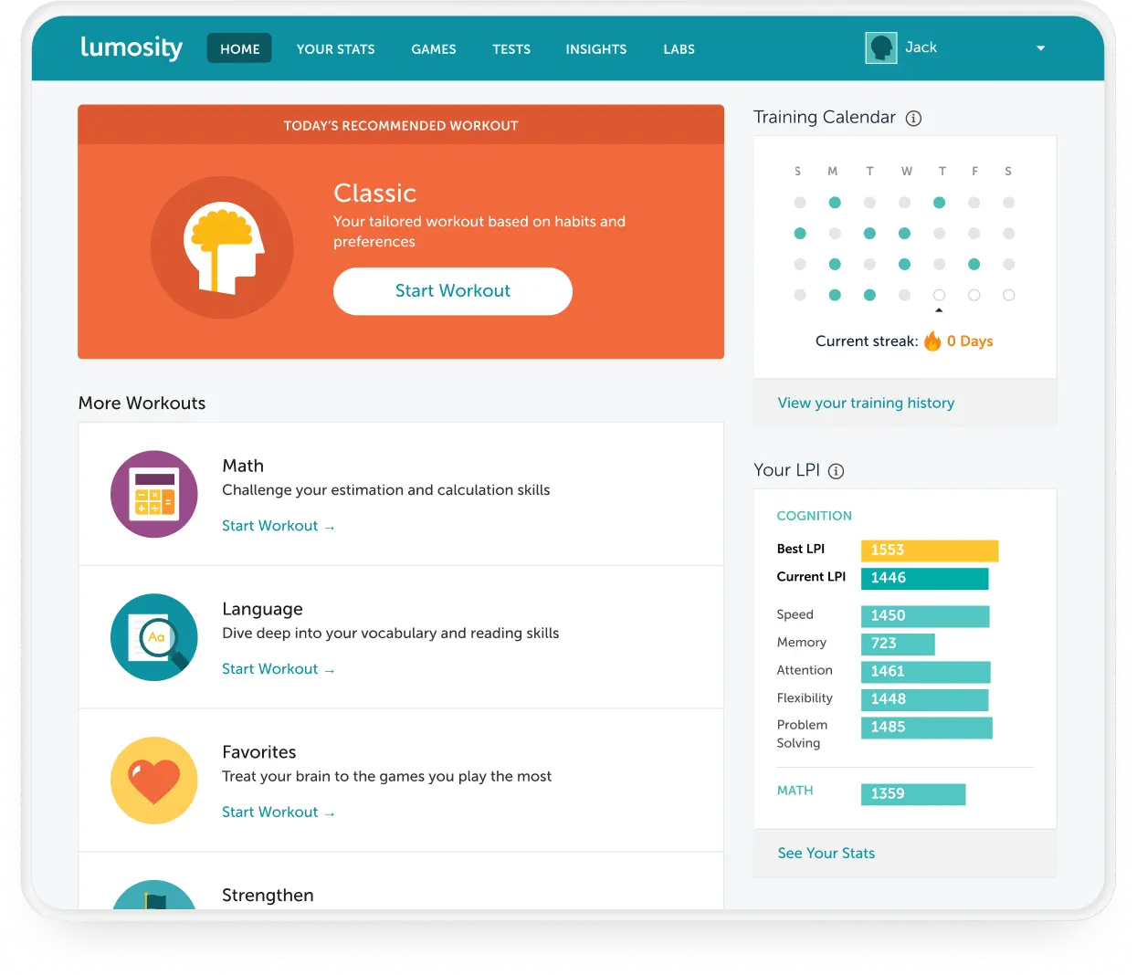
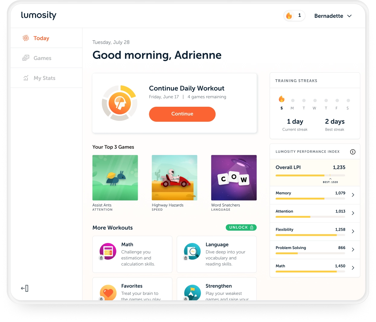
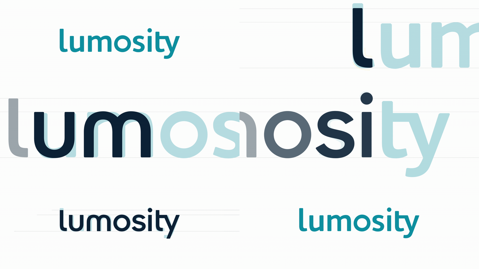
I had been at Lumos Labs for a couple of years at this point, growing from a Senior Designer into a Lead Product Designer, earning increasing responsibility across several teams. Two years before this initiative started, I was part of the marketing and brand teams where we refined the brand architecture and identity as part of the initial product refresh that would set the visual tone for the new product.

02 — THE STAKES
Tackling an initiative of this scope on a live product was risky
We had a user base of over 100 million subscribers, and a misstep in our decisions could translate directly into churn at a scale the company could not afford.
Some of the challenges we were up against included:
- fragile, decade-old codebase
- legacy game engines
- outdated interaction patterns
- broken UX scenarios
- subscriptions in decline
- increasingly competitive market
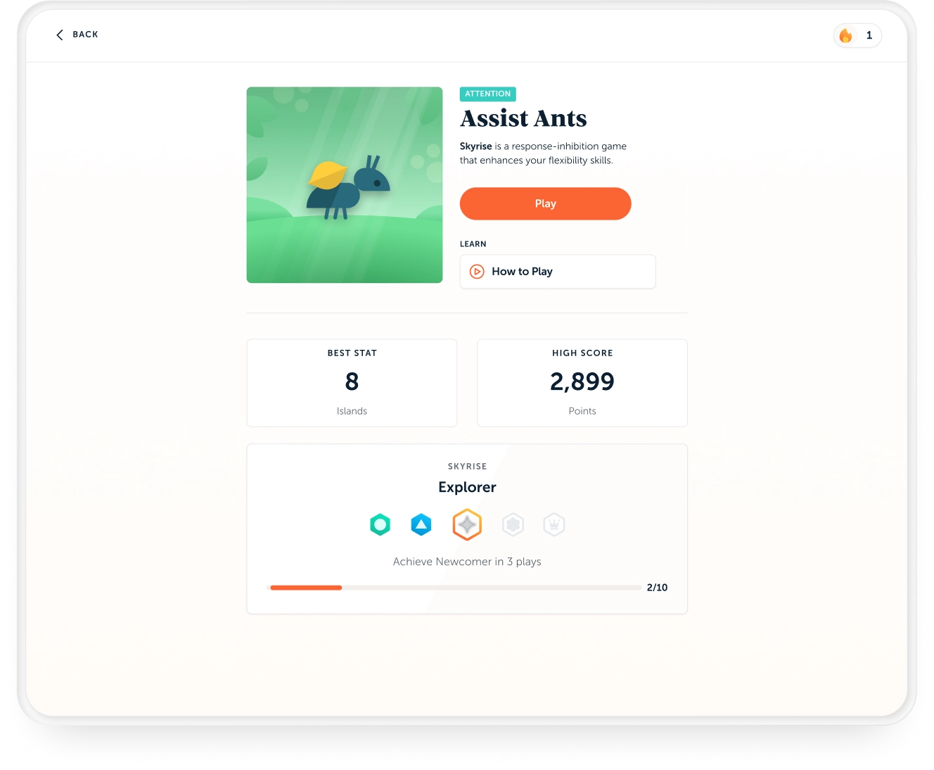
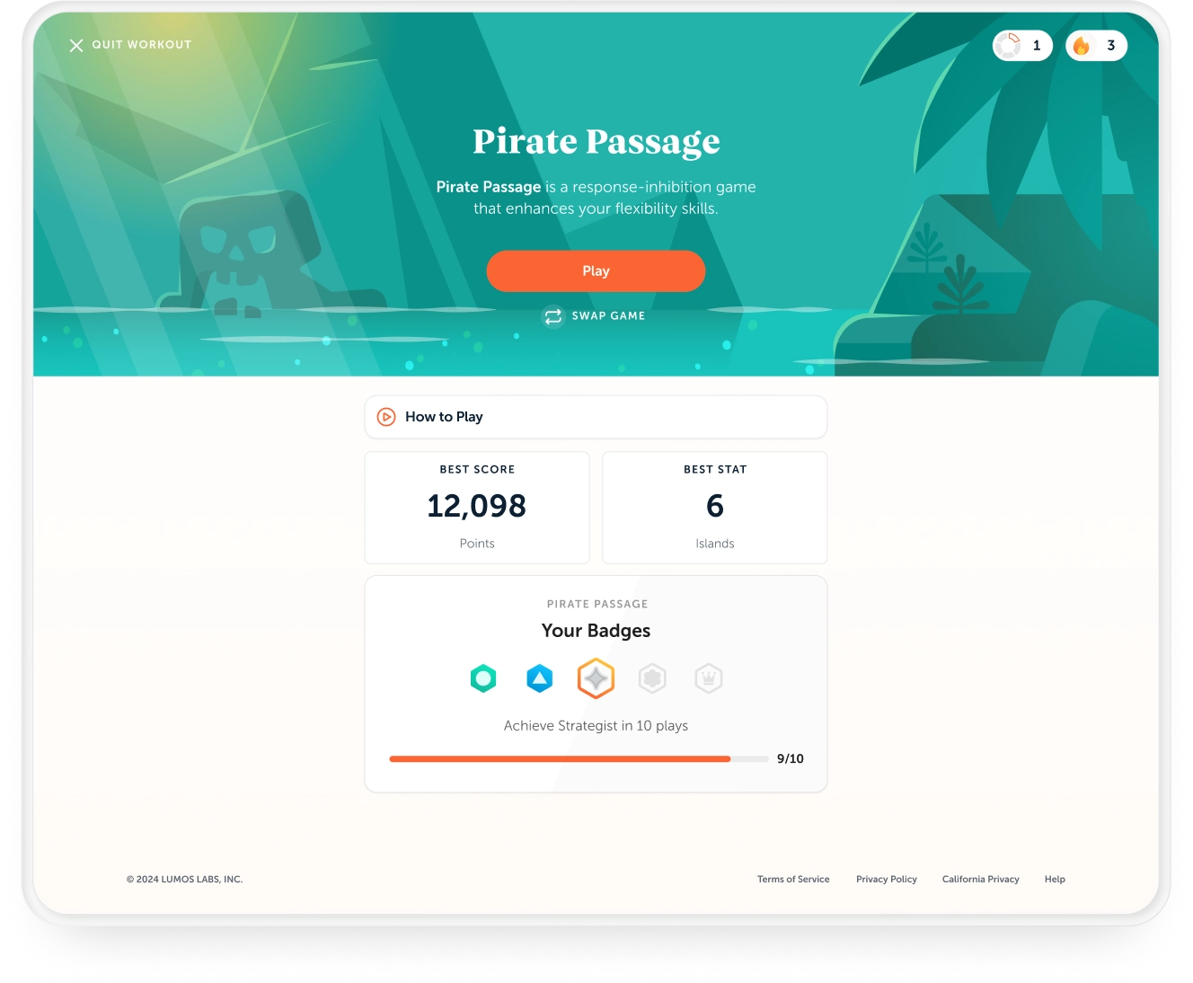
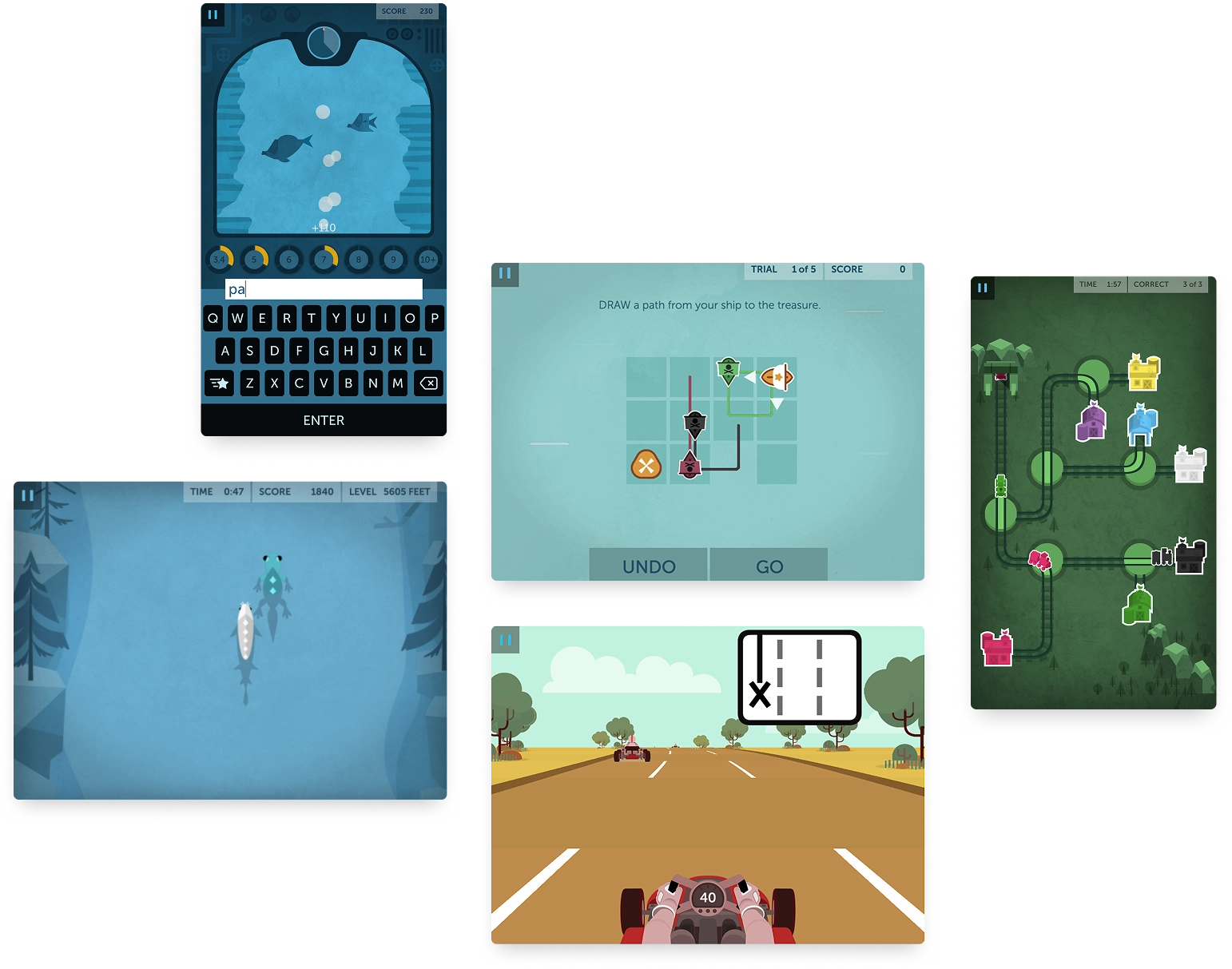
An added layer of complexity was that the games were built in Unity while the UI wrapper was native web and mobile. Making those two technologies feel like a single, coherent product required close cross-functional collaboration with engineering and the games team throughout all phases of design, production, and post-launch. In practice, that meant working directly alongside developers year-round, testing designs on a staging server, pairing on feature builds, and fixing bugs in production.
Unity Games
03 — DESIGN DECISIONS
An entire application, rebuilt as one coherent system for web and mobile customers
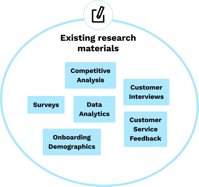
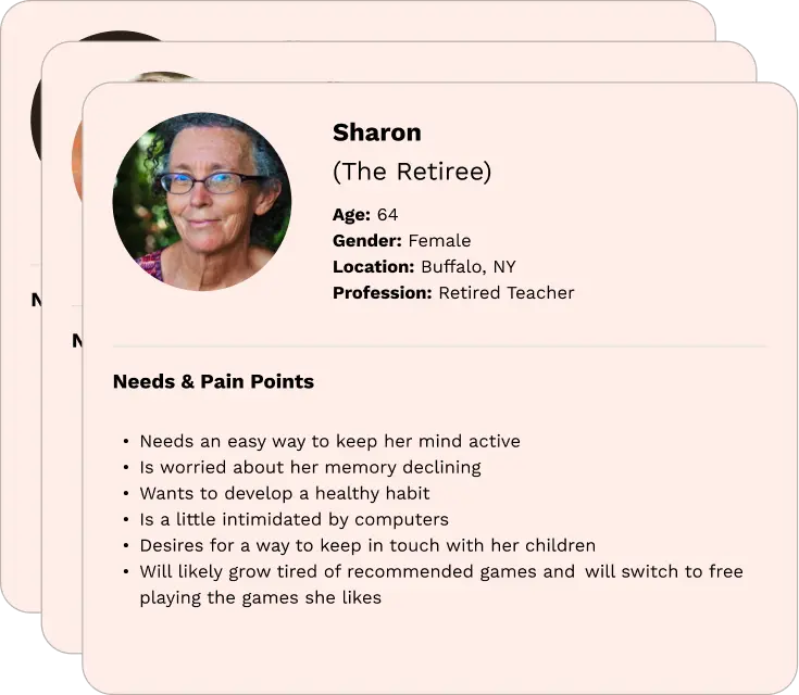
We kept users at the center of every decision, starting from a well-defined foundation: established personas, documented pain points, and a clear set of user needs built up over years of customer research. We leveraged app store reviews, surveys and conversations with our CX team as a continuous signal. All three designers collaborated on the UX, ensuring decisions were shared and reviewed.
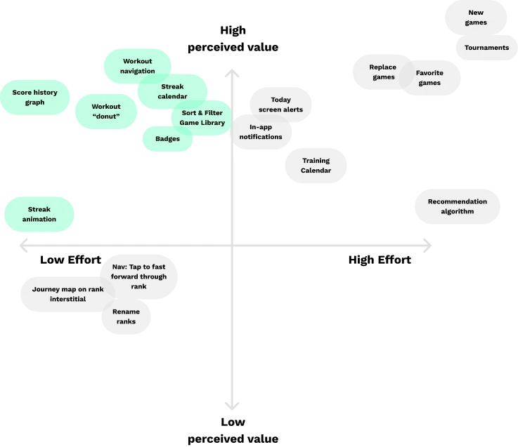
Midway through the redesign, we launched a stripped-down beta version of the web app that had our most ambitious changes. Current users were invited to join the beta and participate in weekly live usability testing sessions. This feedback was used to confirm or counter our design decisions and come up with solutions based on informed assumptions.
Limited Beta Release
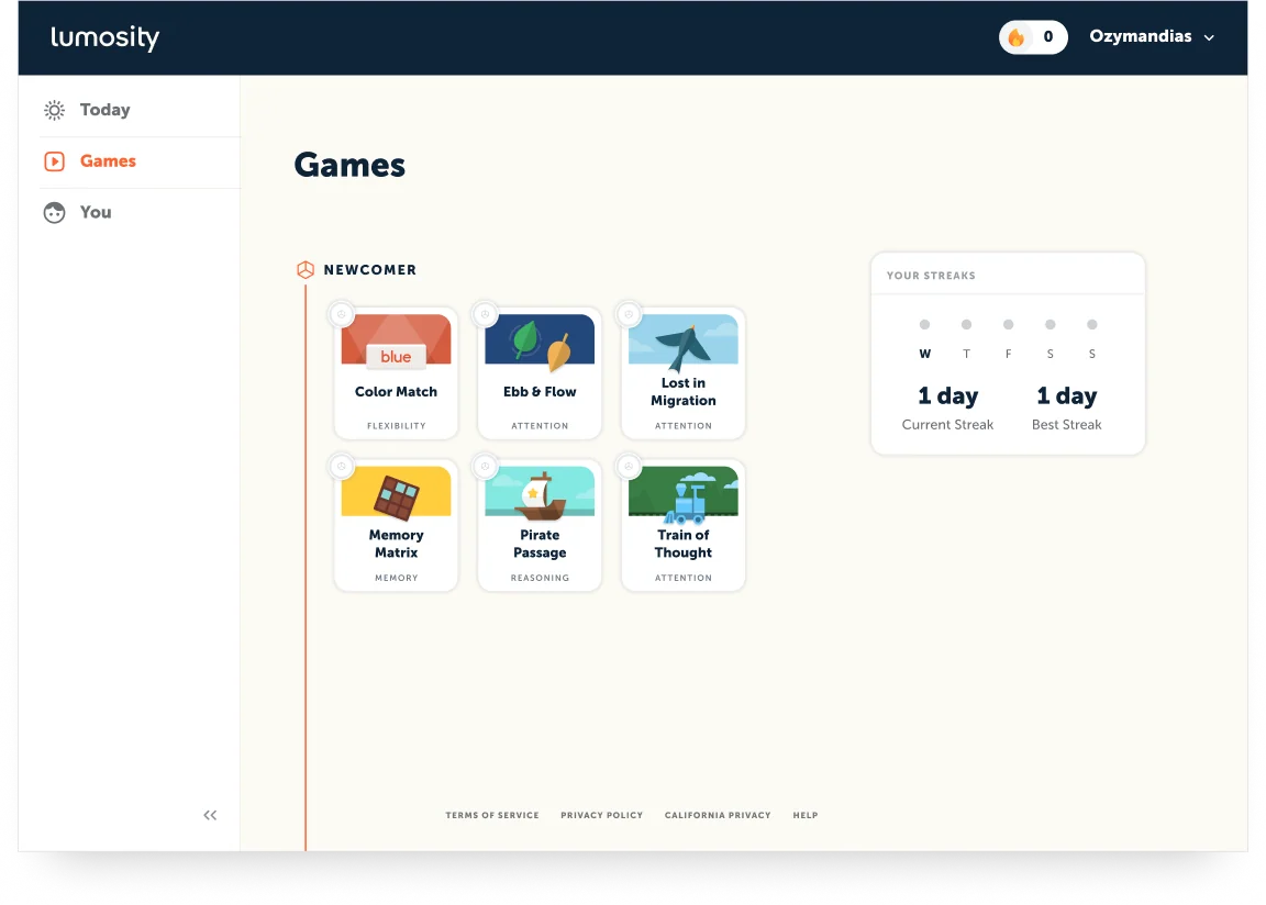
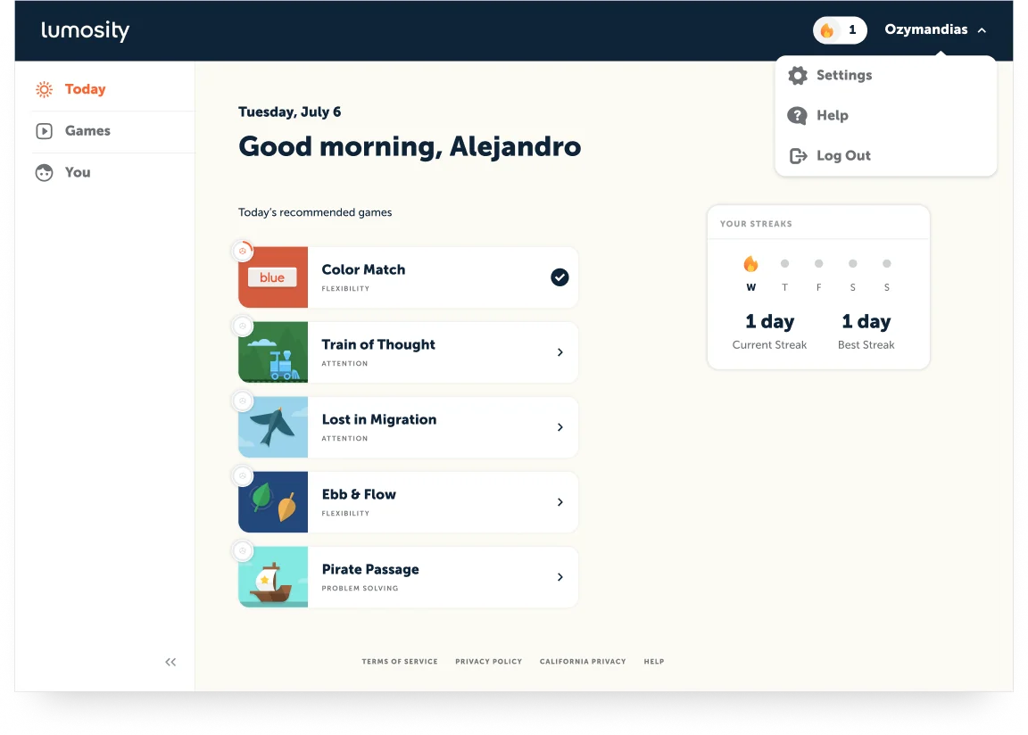
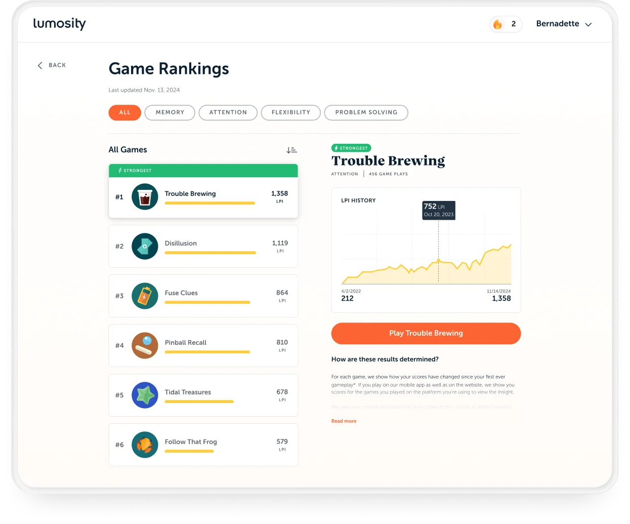
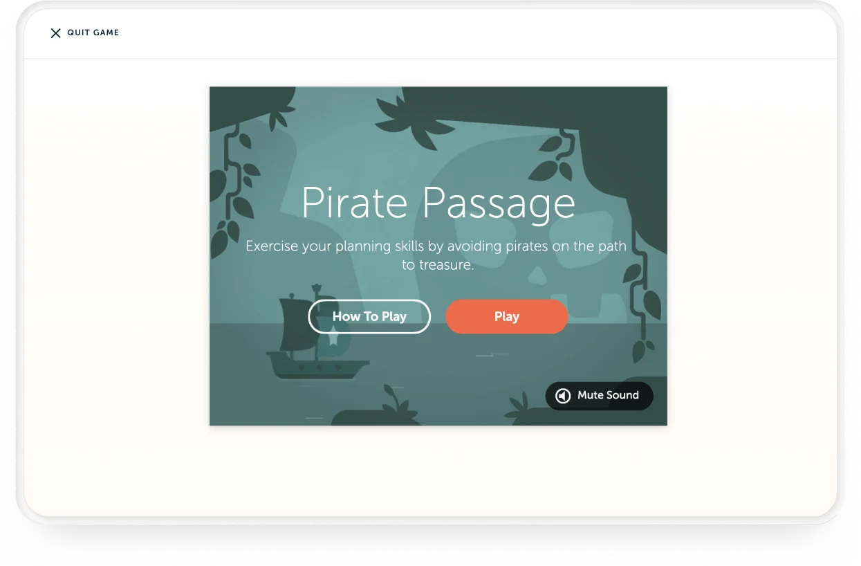
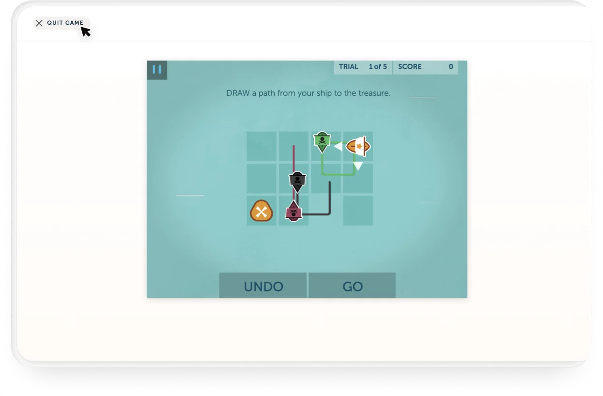
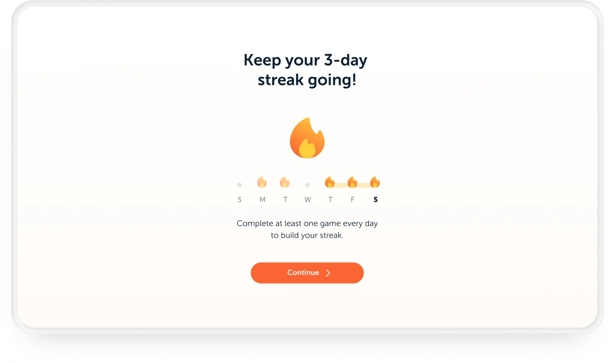
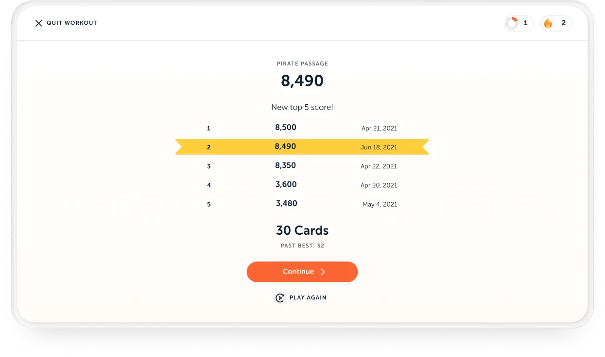
I owned the web UI end to end, working alongside my counterpart who led the mobile UI. Together we covered onboarding, the daily workout, game browsing, game detail pages, performance insights, the core game flow experience, stats pages, and more.
Worldwide Release
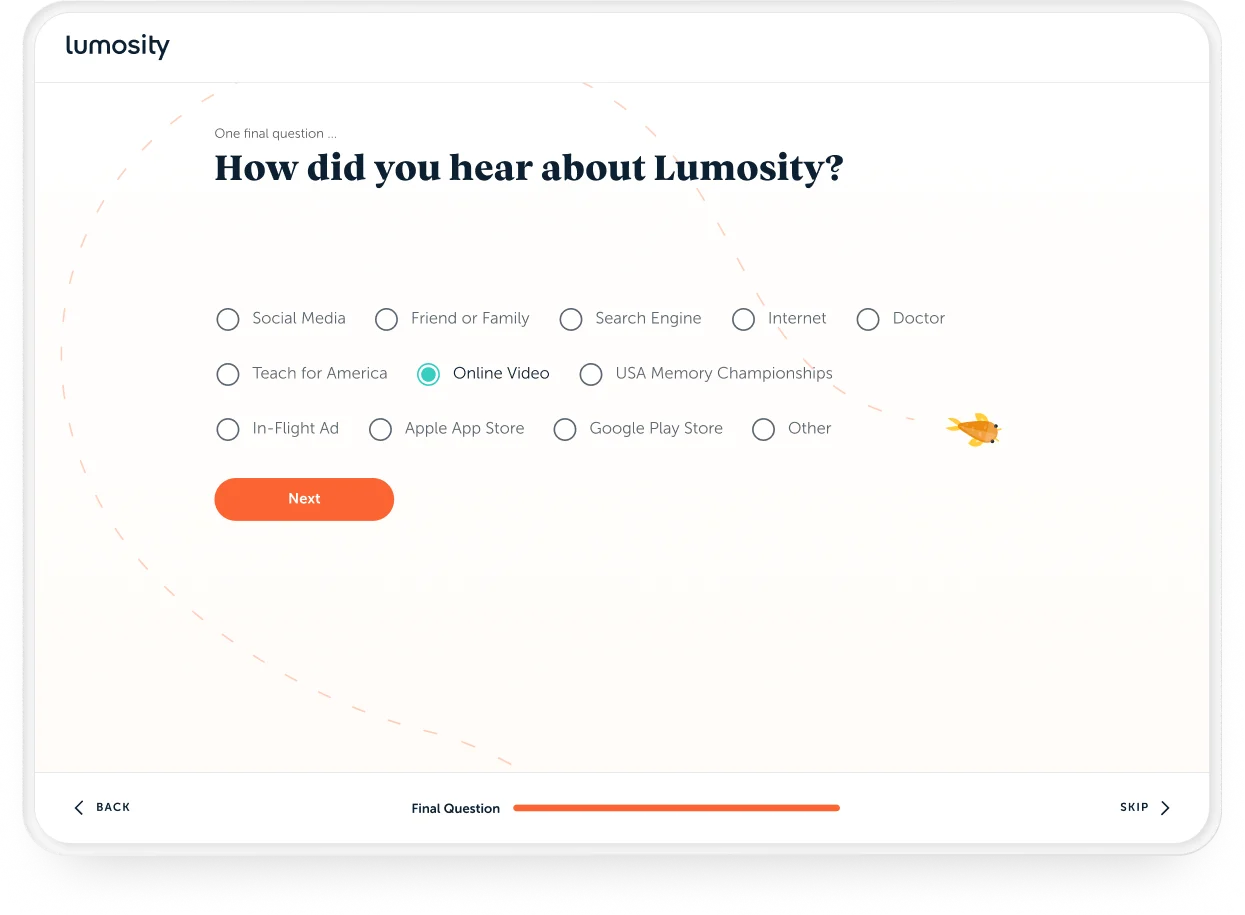
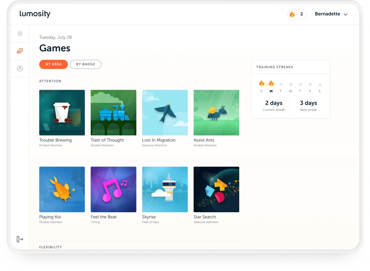
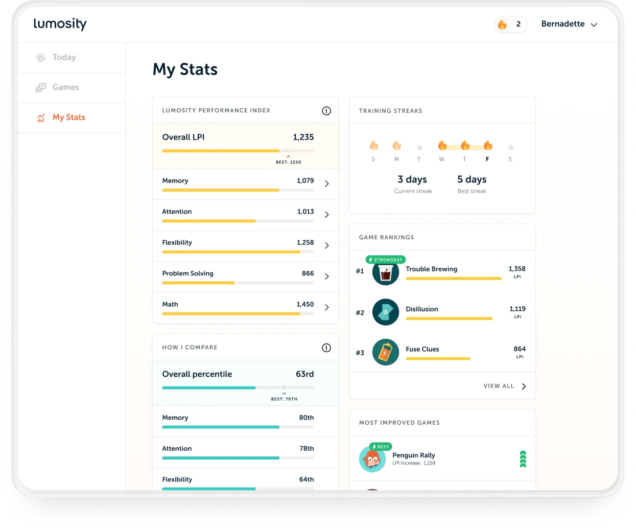
04 — DESIGN SYSTEM
Building a solid foundation for a scalable design system
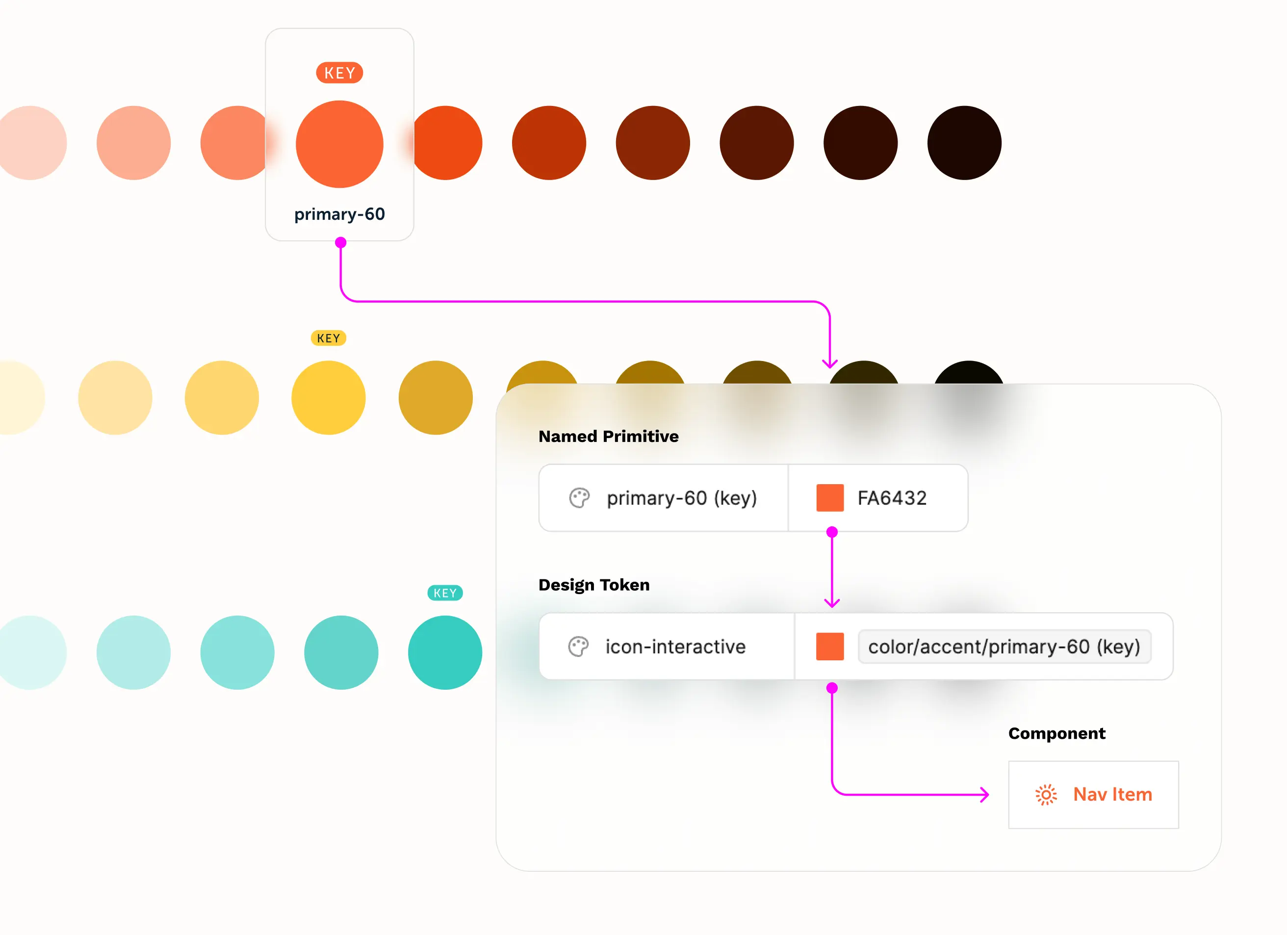
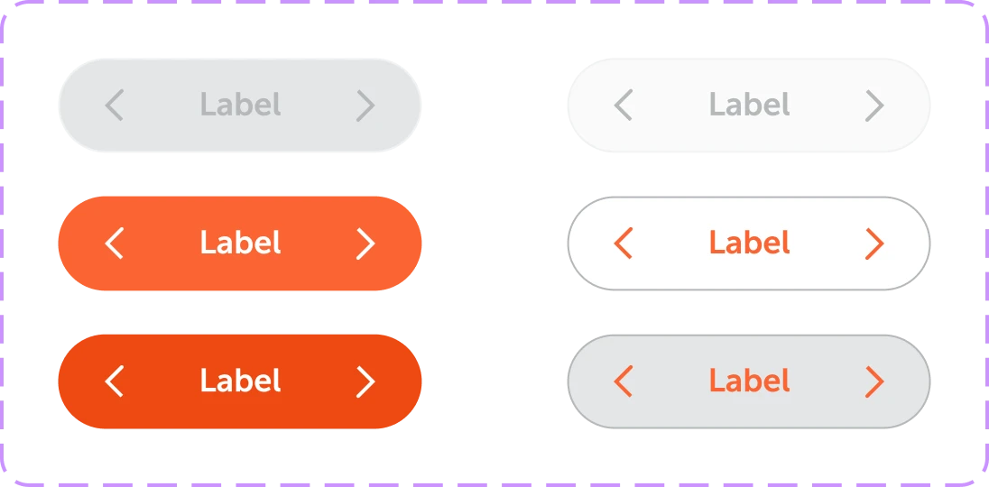
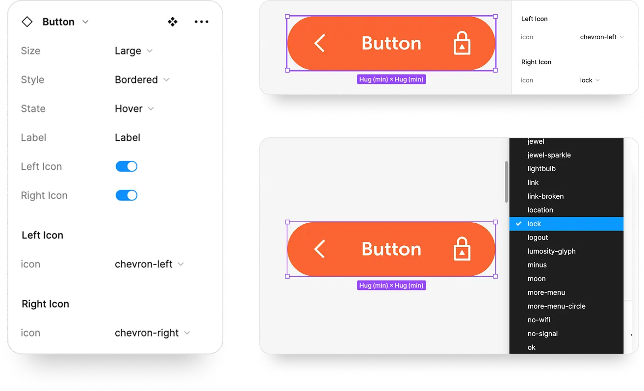
I co-led the design system with my counterpart, establishing design tokens, components, and patterns early. A two-tier token system, covering scores of primitives mapping into component-level tokens with full light and dark mode support, gave us a shared foundation that could scale across web and mobile. In addition, I took the initiative to design a custom icon set of 80+ icons, each named, gridded, and componentized in Figma.
Color Tokens
Button Components
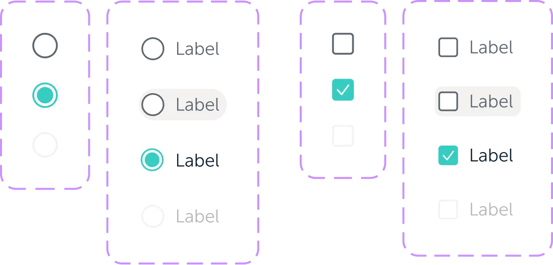
Inputs
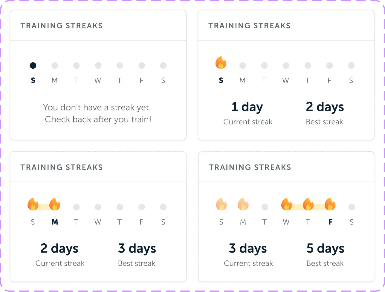
Streak Calendar Widget
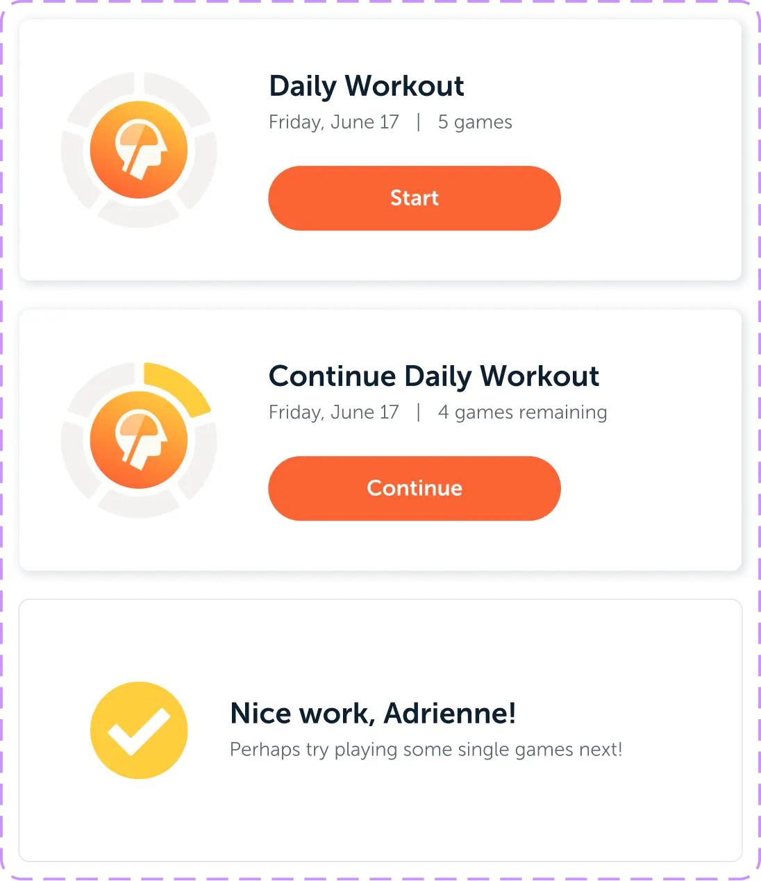
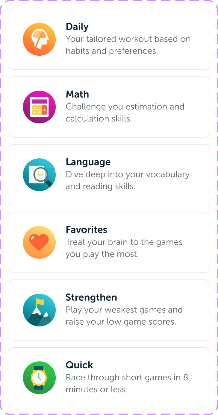
Cards
Custom Icons Component












05 — THE LAUNCH
A new product experience for users across the globe
The launch rolled out in phases, starting in Asian markets to validate the experience before a wider release. I supported the developer handoff and early QA through that first phase, working closely with engineering to catch issues before they reached a larger audience.
The redesign shipped in 2025 to Lumosity’s full global subscriber base. The interaction patterns, the design system, and the UI decisions from this initiative are what people use today, every time they open the app.
100M+
Subscribers
6
Languages
40+
Games
8B+
Game Sessions
4.7

App Store Rating (129K)

Editors’ Choice
Apple App Store
App of the Day
August 2026